Plot functions
Zorro can generate charts, histograms, or scatter plots, and export the data
in CSV or image format for further evaluation. The profile
library contains often-used functions for diagrams. The following plot
commands are available:plot(string Name, var Value, int Type, int Color)
plot(string Name, vars Data, int Type, int Color)
Plots a variable, or the first element of the Data series, on
the current bar position on the chart. The value can be plotted as a dot, line, bar, or band, dependent on Type.
The plot is linked to the current asset.
plotBar(string Name, int Pos, var Label, var Value, int Type, int Color)
Adds a value to a given x axis position in a histogram. A histogram consists of vertical bars that display the sum, average, standard deviation, maximum, or minimum of the values added to any x position.
It can be exported to a CSV file for further evaluation.
plotHistogram(string Name, var Value, var Step, var Weight, int Color): int
Variant of plotBar for plotting a histogram bar. The
Value range is dividied in equidistant Steps. Bars belonging to the same
Step are accumulated by adding their Weights.
Returns the x axis position of the bar.
plotGraph(string Name, var X, var Y, int Type, int Color)
Plots a dot, symbol, line, spline, or polygon at a given X,Y position with the given
Color either to the current chart, to the current histogram
created by plotBar, or to a scatter plot when Type
was combined with GRAPH. Call this function to mark certain events in the price chart.
plotText (string Name, var X, var Y, string Text, int Style, int Color)
Displays the Text with the given Color at a given
X,Y relative or absolute position (dependent on Style,
see below) on the
current chart, scatter plot, or histogram. Text on relative positions scrolls with the
other chart elements and is only visible when the chart is above a
zoom factor determined by PlotText.
plotData (string Name): DATA*
Returns a pointer to the DATA struct with the data stored by a chart plot or histogram
with the given Name. The DATA struct is defined in include\trading.h. DATA->Data[DATA->start] is the first valid data point, and
DATA->Data[DATA->end] is the last. The data points are in
chronological order. DATA->Data[n] is the data point at bar
number n, and its timestamp is therefore wdateBar(n). The function can be used for retrieving the plot curve, for analyzing it, for modifying data before plotting,
or for exporting it to other charting tools.
plotChart (string FileName)
Generates a chart or histogram from the previous plot calls, and displays it with the
chart viewer or
stores it in a .png file with the given FileName
when PL_FILE is set.
Exports it to a CSV file when PL_EXPORT is set. Deletes all plot elements so that new plots can be built afterwards. Use this
function to update charts or histograms in real time (see
PayOff.c). If this function is not used, the chart is generated at the end
of a backtest or when clicking [Result].
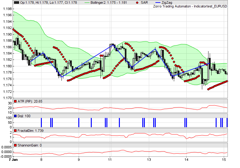
Chart with candles and indicators, created with
plot commands
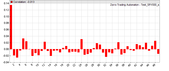
Autocorrelation histogram created with plotBar
commands
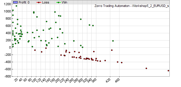
MAE scatter plot, created with plotGraph
commands.
Parameters:
| Name |
The name for the chart legend; a string constant with up to 15 characters. Different curves
- including the upper and lower curve of a band - must have different names. If the name begins with '#',
it does not appear in the chart legend. |
| Pos |
The bar number in a histogram in the -4000..4000 range. Determines the bar's position on the horizontal axis. All plotBar commands with the same bar number
affect the height of the bar in various ways, dependent on the
Type parameter. |
| X,Y |
In a histogram, X is the bar number in -4000..4000
range, and
Y is the position on the vertical axis.
In a scatter
plot, X and Y are horizontal and
vertical coordinates
in arbitrary units.
In a price chart, X is the
bar offset (0 = current bar), and Y is the position on the left or right vertical axis. |
| Label |
A number printed on the horizontal axis at the given Pos position, or
NIL for no label. For
better readability, label numbers should be in the ±0.1 .. ±1000 range
and should be not too tight together. |
| Value |
The data value to be plotted or added to the bar. Use 1 in combination with SUM for counting events.
For plotting an int, cast it to var. |
| Text |
Short text to be plotted on the chart; up to 15 characters. For
longer texts put several plotText calls together. |
| Data |
The data series whose most recent value is plotted. |
| Type |
The type of the data curve or element in the chart or histogram.
All elements with the same Name must be of same
Type. Use 0 for a simple line
on the chart, or a combination of:
BARS - plot a bar or vertical mark. For plot
and plotBar.
DOT - plot a colored dot. For plot, plotBar, and plotGraph.
BAND1 - for plot, plot the upper line of a band, use the color for the
upper and lower lines. Main chart only.
BAND2 - for plot, plot the lower line of a band, use the color for filling the band.
Main chart only.
LINE - for plot, use a thick line. Otherwise it's a thin line.
AVG - for plot, use the average of all sample cycles.
MAIN - for plot, plot this and all following curves in the main price chart.
NEW - for plot, plot this and all following curves in a new extra chart (see remark below about plot order).
AXIS2 - use a second y axis on the right side of the chart.
LOG - use a logarithmic y scale.
AVG - for plotBar, plot the
average of all bar values at the current x position.
DEV - for plotBar, plot the standard deviation of all values
at the current x position.
SUM - for plotBar, plot the sum of all values at the current x position.
MINV - for plotBar, plot the minimum of all values at the current x position.
MAXV - for plotBar, plot the maximum of all values at the current x position.
NRM - for plotBar, normalize the values of all
bars to 1.
LINE - for plotGraph, draw a
straight line from the last position to the current position.
SPLINE - for plotGraph, draw a
curved line from the last position to the current position.
END -
for plotGraph, end point of a line or polygon started with LINE.
GRAPH -
for plotGraph, plot the element to a scatter
plot.
DEL - for plotGraph, delete the previous plot and start over.
DOT -
draw a colored dot. The size can be determined with PlotScale.
SQUARE - draw a colored square.
TRIANGLE - draw a upwards pointing colored triangle.
TRIANGLE2,3,4 - draw a colored triangle pointing to the left, right, or down.
CROSS - draw a colored cross.
CROSS2 - draw a colored diagonal cross.
|
| Style |
Text style; all texts with the same Name must
have the same Style. Text
centered = 0 (default), aligned to Bottom Left = 1, Bottom
Center = 2, Bottom Right = 3, Left
= 4, Right = 6, Top Left =
7, Top Center = 8, Top Right = 9.
Add 32 for text at absolute X,Y
pixel position (0,0 = upper left corner of the chart). Add 64 for text on a
white background. Add 128 for large bold
text. |
| Color |
Color and transparency of the data curve, bar, symbol, or
text, in the format as described under Colors..
Elements on a histogram or scatter plot can have different colors; on a chart
all elements with the same Name must have the same
Color. If at 0, nothing is plotted,
but the data is stored for later analyzing it by plotData. Use the color function for
generating color ranges, and the plot2
function for plotting curves in two colors. |
Remarks:
- In [Test] mode the chart
viewer either appears automatically after the test, or at pressing [Result], dependent on
PLOTNOW. In [Trade]
mode the live chart is updated in intervals given by on PlotPeriod. In [Train]
mode no charts are plotted; instead parameter histograms or countour
charts are displayed
in a browser. Histograms show the objective value and the number of winning and losing trades for each parameter.
- Histograms, scatter plots, and charts can not be plotted at the same time; plotBar overrides plot.
- The vertical axis of charts and histograms is
automatically
scaled so that all elements are visible. This can cause
'compressed lines' when elements are too far apart or at wrong positions,
for instance a plot at position 0 on a chart with a 1.1 - 1.2
price range. Elements by plotGraph can affect
the scale even when they are outside the visible chart section. If a plot curve appears
compressed
or vertically shifted, it has
likely initial
values outside their normal range. For avoiding this, start the plots after the
lookback period ( if(!is(LOOBACK)) { plot(...); }
).
- When extra charts are opened with
NEW, the order of plot calls determines in which chart the curves are plotted. The order is determined by the first
plot call in or after the FIRSTRUN. Subsequent calls can then be in arbitrary order. When plot order matters and plots depend on
if(...) conditions, enforce the right order in the first run f.i. with
if(is(FIRSTRUN)). Candles and bands are only plotted in the main chart.
- If plot is called several times with the same
Name at the same bar, only the last data value is plotted.
- If a plot command is not called during a bar, the plotted curve will
have gaps at the skipped bars.
This can be used for plotting dotted lines. Example for plotting only at every second bar
in a chart: if(Bar%1) plot(...);.
- Every plot on a chart must have the same Type and
Color. For plotting a curve in different colors, use alternating curves with the same value and different
Name. In a histogram, any graph or symbol can
have an individual color.
- plotGraph and plotText limit to the number of elements (lines, symbols,
texts) per plot to the number of bars on the chart. Exceeding the limit causes an
Error 038 message. For adding more elements to the chart, use
another plotGraph with a different Name.
- Any plot command is normally
linked to the current asset. When
multiple assets are traded, only prices, trades, and curves linked to the asset selected with the [Asset] scrollbox are plotted; curves linked to other assets are only plotted when
PlotMode got set to PL_ALL. For plotting parameters of different assets together, store them in different variables and then plot all together without calling
asset() inbetween.
For instance, inside an asset loop you can
store them in a var array with one element per asset, then plot all elements of the array after the asset loop. The curves are then visible on the chart when you select the last asset of the loop and click [Result].
- For removing chart elements such as price candles or equity curves, set their
Color to 0.
- Use the color function for setting
color ranges in multicolor
histograms. An example can be found in profile.c for the heatmap plotting.
- Use plotData for evaluating or modifying
plots.
- Set the EXPORTED flag for
exporting charts and histograms to a *_plot.csv file in the
Log folder. They can then be displayed with other
charting software.
- For adjusting scale, colors,
symbol sizes, x axis labels etc, set up the corresponding
plot variable.
- Special histograms, such as trade profiles, MAE graphs, seasonal profiles, correlograms or heatmaps can be plotted with the functions from the
profile library.
- Price curves can be plotted even without a
run function - f.i. for
HFT simulation - when the bars are increased by
priceQuote. Make sure that the plot function is then called at every bar for avoiding gaps in the curve.
- Use dataChart for plotting a contour
chart of a complete dataset.
Examples (see also profile.c, indicators.c):
// Compare price distribution (red) with random distribution (blue)
function run()
{
  vars Price = series(price(0));
  int num = NumRiseFall(Price,20);
  plotBar("Price",2*num,num,1,SUM|BARS,RED);

  vars Random = series(0);
  Random[0] = Random[1] + random();
  num = NumRiseFall(Random,20);
  plotBar("Random",2*num+1,0,1,SUM|BARS,BLUE);
}
// plotGraph test
function run()
{
  set(PLOTNOW);
// plot green dots above the price at every 20th bar
  if(Bar%20 == 0)
    plot("Dotted",1.01*price(),DOT,GREEN);

  if(Bar == 500) {
// plot a single blue rectangle in the price chart
    plotGraph("Rectangle",0,0.99*price(),LINE,BLUE);     // start point
    plotGraph("Rectangle",-500,0.99*price(),LINE,BLUE);  // 1st corner
    plotGraph("Rectangle",-500,1.01*price(),LINE,BLUE);  // 2nd corner
    plotGraph("Rectangle",0,1.01*price(),LINE,BLUE);     // 3rd corner
    plotGraph("Rectangle",0,0.99*price(),LINE|END,BLUE); // 4th corner and end point

// plot a single red dot
    plotGraph("Single Dot",-250,price(),DOT,RED);
  }
}
// plot tiny triangles above / below price for buy and sell signals
PlotScale = 8; // size of triangle
if(SignalBuy) plot("Buy",0.9*priceLow(),MAIN|TRIANGLE,GREEN);
if(SignalSell) plot("Sell",1.1*priceHigh(),MAIN|TRIANGLE4,RED);
// plot a chart title
if(Init) plotText("Title",60,25,"My Chart",32+64+128+7,BLACK);
Examples of plotting symbols can be found in the Predict script and in the profile library.
See also:
printf, PlotMode, PlotScale, plotProfile,
dataChart, Colors, color
► latest
version online